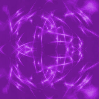

The unit I did by myself turned out better then what i thought because I didn't expect it to look the way I did, I just experimented with it. I am proud that I made it the way I did it because I love the way it looks. My favorite part of the unit was flipping the picture to create the dreamy background and I don't really think there was a part that I don't like. I think I used my creativity so much in this unit because i really played around flipping and creating what I thought look cool, i like how you can can't mess up on the project and if you think you did it ends up turning out good. The class so far has been really good and I have learned a lot in the class. This is one of my favorite classes.
i'm so glad to hear that you've enjoyed the class -- i've really enjoyed having you. i think you've grown a lot as a graphic artists, and i'd agree that you seem to know quite a bit about photoshop now. :-)
ReplyDeletei think your dreamy backgrounds look awesome. they're both beautiful. i'm glad you got to play around and just see what happened -- that sounds like a lot of fun.
lovely work.
GRADING
Creativity: 100
Effort: 100
Artistry: 100
Mastery of Unit Goals: 100
Followed Directions: 100
Unit AVG: 100! yay!